Railou
New Member
 Time is nothing...
Posts: 6
|
Post by Railou on Feb 19, 2007 16:03:45 GMT -5
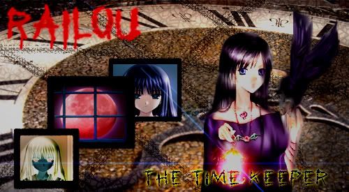
 I know its a little big. Sorry. And now, let's hear my review on it real quick. X3
First off, despair is not spelled like that.I know. T-T Twas late and Fallen was tired. For the rest, 4.0 kinda sucks. -.-; |
|
Horsegirl
Administrator  Admin of RPGSS
Posts: 64
|
Post by Horsegirl on Feb 28, 2007 17:29:43 GMT -5
Hmmm, over all it looks pretty darn good. The wolf in the left top corner needs his edges blended/smudged. You can see the outline of the original picture. Try using the smudge tool on the edges and softly stroking outwards and it should fix that.
Your big wolf is really cool, but the bottom is a little overblended. It seems as if you added more white to the picture instead of just blending the original picture.
I like the rest of it a lot. Your main text could be a little bigger and your sub-text a little smaller, but thats about it. Your copy right is a little bit large, try a size 10 or 9 with copyrights. As long as they are in there they don't have to be huge.
Well, I hope this helps a little bit. Also, what program do you use?
|
|
Railou
New Member
Time is nothing...
Posts: 6
|
Post by Railou on Mar 7, 2007 17:37:49 GMT -5
I use Elements 4.0
(is still trying to get mother to order 5.0)
And thanks for the tips. I'll defiantly try that. ^-^
|
|